Get started
SwiftUI is a bit of a paradox. Apple introduced the new UI toolkit at their developer conference in 2019 as a way to eventually replace the standard UIKit code and storyboard approach. In moving away from a WYSIWYG app layout tool with one exclusively through code, Apple made implementing app designs both harder and easier.
SwiftUI code is a lot simpler and modern compared to the way UIKit is implemented. The use of storyboards was always a running argument for developers, with some preferring to use only code to express the UI. This may seem odd for designers who would never dream of writing out the markup that under the hood constructs any Sketch or Figma layout. The storyboard offered a graphical layout tool which had many limitations, and became hard to use with auto layout constraints.
Without an immediate visualization of an app screen, developers have to build and run an app to see the code results and compare to the design. SwiftUI puts that preview in the Xcode editor with live updates as code is written. Interacting and multi-device previews are only a click away.
SwiftUI is a design tool, and learning it is similiar to learning another tool.
In Xcode, when you create a new SwiftUI View file, you are creating the equivalent of an artboard. By default it contains a text element which you can modify or delete. Since you will likely need text elements in your layout, we will get familiar with Text().
Like the text box on your Figma artboard, you can modify the appearance in SwiftUI. There are two ways in Xcode—code and the Inspector panel. Let’s put the code approach aside and focus on the Inspector, and making changes the old WYSIWYG way. Even putting the code approach aside, as you make changes in the Inspector panel, SwiftUI code will be added automatically for you—this is an excellent way to learn the code.
You may wish to follow along in Xcode, which means you’ll need to have Xcode running on your Mac. However Xcode is not required just yet!
With the ContentView file selected and the preview panel open, there's no need to type code into the editor yet. Instead by clicking on the Hello world text in preview, the Inspector will display controls for that element. The Inspector has two sections—basic attributes (property) and modifiers.
Attributes
In the case of the Text() view, there is one attribute, the content. This can be edited in the Inspector panel text input field. It is easy to change the words on screen to “SwiftUI rocks!”, simply edit the input field text. Once you update the Text content, the code will automatically be updated. Other view elements have more attributes for finer control, and we’ll discuss those later.
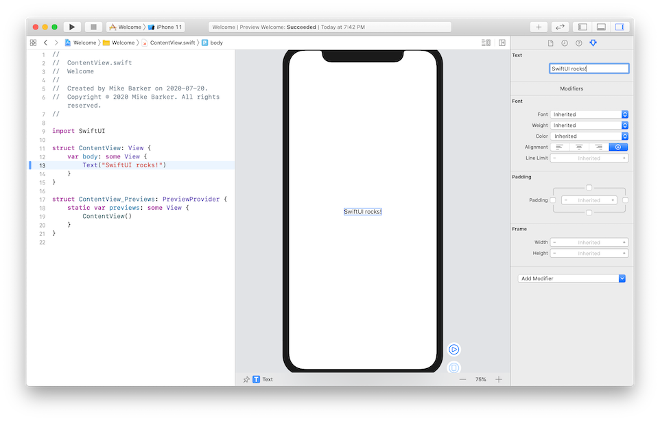
As a rule of thumb, the attributes appear inside the () parentheses, and modifiers appear after and start with a . full-stop. Some views require a default attribute, while others rely on modifiers.
Modifiers are more important for changing the look of our Text view. The Inspector panel contains controls for changing the Font (which is called the Text style in Figma), Weight, Color, Alignment, and other modifiers that affect the text shape of the Text view including padding and the frame size. We can also add more modifiers that aren't yet visible on the Inspector panel, which is discussed below.
By default SwiftUI uses system fonts and colors which are detailed in the Human Interface Guidelines. We can customize these aspects later, but for now we’ll stick with the default HIG styling.
The Human Interface Guidelines are a valuable resource which should be required reading for mobile app designers. Right now I will focus on Typography and Color. To me the best part of each document is the reference table.
Typography
When creating apps that adapt to the customer’s phone settings and needs, you want to stick to using Dynamic Type Sizes. Apple does also recommend the use of the “built-in text styles whenever possible”. The typefaces San Francisco (sans-serif UI font) & New York (serif font used in your iPhone Books app) were created to be most legible on Apple devices. And you can even soften the look of SF with SF Rounded.
Of course your app will likely want to express its own visual style that fits your brand, and this is possible in SwiftUI, however some consideration is required to maintain the Dynamic Type Sizes. Once you use a custom typeface, you need to include a fixed font size, rendering what was a Dynamic Type size, non-dynamic. This matters for all people using Apple devices, no matter if they have increased their iPhone Text Size to xxxLarge or have turned on the larger accessibility type sizes. Fortunately I have a solution which we’ll explore much later.
In the real world you would not break the accessibility of your app, and you should avoid it in design too. However, for the purpose of a prototype, we may need to break a few rules, or hack SwiftUI to achieve the correct look & feel. Afterall, no one said we were making production-quality code.
Modifying Text
Returning to the modifiers, you can see from the Preview panel that I can pick a font, increase the weight and set the text color. You may have also noticed that each modifier gets added in the code editor. This allows us to explore what other options we have in Xcode before having to start typing code.
I can turn on the Padding and set a value—my Text view has grown bigger as a result. We need to be careful with the Frame sizing as this will create a fixed size. Leaving default values will allow the view to adjust to its contents. Also, you will find Padding and the Frame will mix oddly.
Add modifiers
The Add Modifier drop down allows us to add even more customization. The dropdown contains every modifier available, including ones not applicable to views like Text. We can experiment and see what works. For example we can add the background modifier. This will give us a dropdown of the default system colors, plus the ability to use a custom color.
Selecting this option will insert a piece of placeholder code in the editor, however selecting Custom a second time will bring up a color picker so you can manually pick a color or enter the RGB values. By default SwiftUI is declaring the RGB values between 0.0 and 1.0, translating 255 to equal 1.0. While you can set the values for the additional modifiers in the inspector panel, they remain highlighted in the code editor.
Views = Layers
The term “Views” gets used a lot in describing SwiftUI, and this can get quite confusing. However, relating in familiar terms, both Sketch and Figma use the term “Layer” to name elements (text, image, shapes) and artboards. So, Views = Layers.
You will find that individual elements are called views (text, image, etc), a common reusable UI component can be a view, a file will be called a view, and the entire screen is a view. Apple groups these view types as Control, Layout and Other views.
What's this struct
When you create a new SwiftUI View file, you will be presented with the default code to get you started—and to stop Xcode from showing an error. Simply put, there needs to be something between the the curly braces {} when you declare body. In this case, the body at least contains a Text() view discussed previously.
import SwiftUI

struct ContentView: View {
    var body: some View {
        Text("Hello, World!")
    }
}
Starting at the top, first you import the SwiftUI library. You won't need to change this or worry about adding a new library for now. This is followed by the meat of the file, the struct.
The struct is the building block of your code. When you start, the first two structs created in the Swift file are both named after your filename. The second struct with the _Previews: PreviewProvider suffix is the bit of code that creates the preview of your design. The single view inside this struct calls the first struct. In other words, this tells the Preview window to display a preview of the main struct where the real layout will be. When your app is built, this will be ignored.
The first struct will contain all the SwiftUI to show your layout. For now we'll focus on the one variable (var) called body which is some View. This defines a variable that will contain a View inside the braces. And in this case all it contains is Text("Hello, World!"). You can actually only return one view inside View, but the trick is to make that view a wrapper for all your own SwiftUI elements.
A SwfitUI View file can contain numerous separate structs to build your layout. Again this file is like your Figma artboard—it's the frame that all your elements will be grouped inside. Each struct is its own group or component. And you can break down your design into reusable components by moving repeated elements into their own struct
Layout a single-view
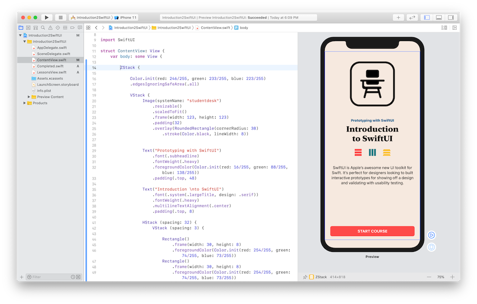
Let’s dive into some of the other views available in SwiftUI and walk through the layout of a design in Xcode. I’ve created a simple screen that includes many of the basic elements in SwiftUI which also make up a common design.
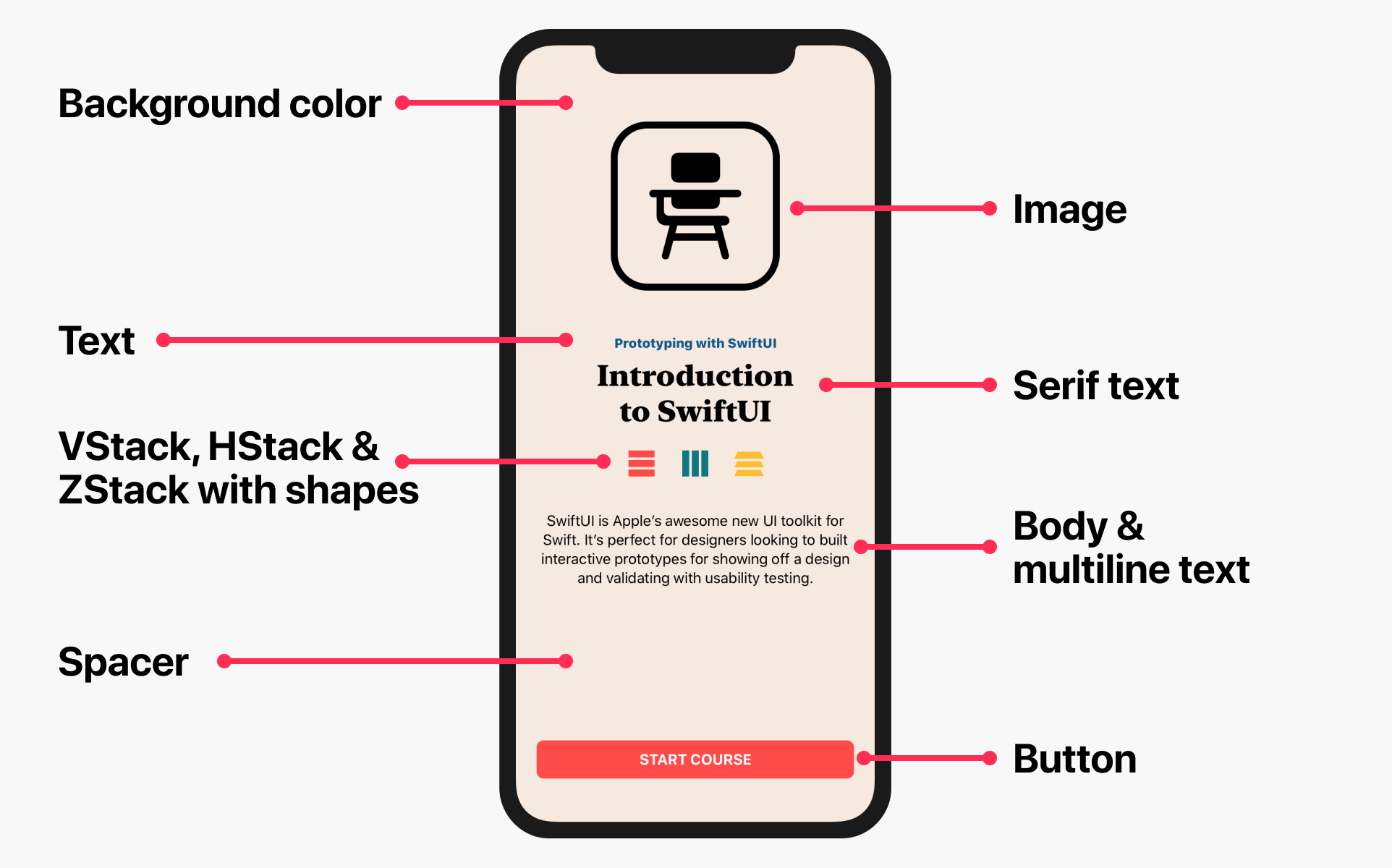
Backgrounds
Many tutorials work from the middle out, maybe picking an important element such as the title to begin. My designer brain wants me to start with the background, which is probably for the best.
We will start by wrapping the entire view in a ZStack. It's worth noting that the order of elements inside the ZStack is the opposite of your Figma/Sketch layers list, so we’ll start with the background first.
We’re going to declare a Color here. This is not a modifier—we’re really saying, give me a Rectangle of this color and fill the space. However we also need to turn on the .edgesIgnoringSafeArea modifier, otherwise the color won't bleed to the edges.
With the background set I’m going to add a VStack after the color, which is the next layer. This vertical stack will group together all of the screen content. Should we want our button to be sticky (or any other element), we would not include that in the VStack.
From here we’re going to add from top to bottom, an image, two text views, a collection of shapes, our paragraph, and finally the button. We’re not going to achieve pixel perfect perfection, however we’ll come close and our design will be better for it.
Images are as common as text in most apps—even a basic list app is likely to have icons for the tab bar. Apple also introduced SF Symbols alongside SwiftUI, giving us access to a large collection of type weight scaled images. You can download the SF Symbols app from Apple and start exploring their icon collection, and export the template for use in your design mockup. As these images are included in iOS13 and above as a font, the symbols are already vector images.
There just so happens to be a school desk symbol that seems perfect for this design. Similar to declaring a text view, the contents of the image will appear between the parentheses, after which we’ll add out modifiers.
Image(systemName: "studentdesk")
  .resizable()
  .scaledToFit()
  .frame(width: 123, height: 123)
  .padding(32)
  .overlay(RoundedRectangle(cornerRadius: 38)
      .stroke(Color.black, lineWidth: 8))
Initially the image will appear small so we use the resizable(), scaledToFit() and frame() modifiers to tell SwiftUI, we want to resize the image, maintain proportions when scaling it, and declare the size we’ll make the image. I have then wrapped the image in a RoundedRectangle shape with 32 points of padding.
I’ve done this in an overlay which has the rectangle and stroke modifiers as its contents. Had I wanted a square box, I could have used a simple border() modifier which takes a color (Color.black) and width of 8 points. When we’re using more generic modifiers, we need to specifically write that we’re using a color which is the predefined system red.
Next we’ll place the two Text views for the label and headline. With the label, I’ve chosen the .subheadline font to get a 15 point font size. I’ve selected the .heavy font weight and given the text a custom color by using the foregroundColor modifier. The color is declared as an RGB value on the 0–255 scale.
Text("Prototyping with SwiftUI")
   .font(.subheadline)
   .fontWeight(.heavy)
   .foregroundColor(Color.init(red: 16/255, green: 88/255, blue: 138/255))
   .padding(.top, 48)

Text("Introduction \nto SwiftUI")
   .font(.system(.largeTitle, design: .serif))
   .fontWeight(.heavy)
   .multilineTextAlignment(.center)
   .padding(.top, 8)
With most of the views on this screen I have added padding just to the top to give varied spacing. We can actually define a constant spacing value for our stacks, which I will demonstrate below.
On the headline I’ve gone for a serif typeface in the design, which means I need to modify the text view to use this ‘design’ while also setting the text to largeTitle, the biggest type style in SwiftUI. While views are placed on the screen aligned down the middle, the text inside a text view is left aligned by default, so I added the multilineTextAlignment modifier. That was an easy one to add from the Inspector panel if you ever find yourself forgetting its name.
Finally because I’m a designer, I put in a little hack to insert a soft line break after “Introduction” to create two even lines of type by using “\n”. [if you wanted to known \t = tab]
The next section really illustrates many different layout constraints in SwiftUI to create the three icons in code. We’ve already used the Z and V stack, so now welcome HStack to create the horizontal row. This essentially groups three more stacks in a row evenly spaced with 32 points between. These icons are all made from the Rectangle shape arranged in two VStacks and an HStack. The repeating Rectangles are actually quite repetitive so it’s possible to use code to build one item three times which you can see with the HStack.
HStack (spacing: 32) {
   VStack (spacing: 3) {

       Rectangle()
           .frame(width: 30, height: 8)
           .foregroundColor(Color.init(red: 254/255, green: 74/255, blue: 73/255))
       Rectangle()
           .frame(width: 30, height: 8)
           .foregroundColor(Color.init(red: 254/255, green: 74/255, blue: 73/255))
       Rectangle()
           .frame(width: 30, height: 8)
           .foregroundColor(Color.init(red: 254/255, green: 74/255, blue: 73/255))
   }

   HStack (spacing: 3) {
       ForEach(1...3, id: \.self) { rect in
           Rectangle()
               .frame(width: 8, height: 30)
               .foregroundColor(Color.init(red: 16/255, green: 119/255, blue: 128/255))
       }
   }

   VStack (spacing: 0) {

       Rectangle()
           .frame(width: 30, height: 11)
           .foregroundColor(Color.init(red: 252/255, green: 191/255, blue: 50/255))
           .rotation3DEffect(Angle(degrees: 45), axis: (x: 90.0, y: 0.0, z: 0.0))
       Rectangle()
           .frame(width: 30, height: 10)
           .foregroundColor(Color.init(red: 252/255, green: 191/255, blue: 50/255))
           .rotation3DEffect(Angle(degrees: 45), axis: (x: 90.0, y: 0.0, z: 0.0))
       Rectangle()
           .frame(width: 30, height: 10)
           .foregroundColor(Color.init(red: 252/255, green: 191/255, blue: 50/255))
           .rotation3DEffect(Angle(degrees: 45), axis: (x: 90.0, y: 0.0, z: 0.0))
   }
}
The final VStack icon to simulate a ZStack has slightly different dimensions making a loop more work. This VStack also uses the rotation3DEffect modifier to tilt the Rectangle back 45-degrees on the x-axis. This took some trial and error while I first attempted to update the x- and then y-axes.
Following this is a paragraph describing the Introduction of SwiftUI course. The Text is set to .body type style, and aligned to match the rest of the design.
Text("SwiftUI is Apple’s awesome new UI toolkit for Swift. It’s perfect for designers looking to built interactive prototypes for showing off a design and validating with usability testing.")
  .font(.body)
  .multilineTextAlignment(.center)
  .padding(.top, 32)
Before adding the final view, including a Spacer() view that takes up the remaining vertical space and forces the button to the bottom and the elements above towards the top. You can add multiple ones, such as one above the Image to have 2 even Spacers filling the available space evenly.
Spacer()The Button has two sections—the action (what will happen when someone taps the button) and the content & modifiers that make up the Button. You could put a number of different views inside the Button, such as a shape or image (or in fact an image that’s just an icon from SF Symbols).
Button(action: {
    // the action
}) {
   VStack {
      Text("Start course".uppercased())
        .fontWeight(.bold).font(.body)
        .frame(minWidth: 300, maxWidth: .infinity, minHeight: 44, maxHeight: 44)
            .background(Color.init(red: 254/255, green: 74/255, blue: 73/255))
        .foregroundColor(.white)
        .cornerRadius(8)
        .padding(.bottom, 16)
    }
 }.padding(.top, 16)
We’ve seen many of these modifiers before, however for the Button there are some differences. A background is set with a custom color. The foregroundColor is then set to white—the default tint on Buttons is the system blue. Since a background is used, the cornerRadius modifier works correctly—adding a border would then not work perfectly. A shadow can even be added to give the Button some depth.
One final piece, two padding modifiers on the whole VStack collection. Multiple padding modifiers are allowed in order to have greater control, first with 24 points of horizontal (left and right) padding, and 48 points added to the top to push the whole stack down slightly. Horizontal padding wasn’t included on any of the previous elements and instead gets applied to the entire VStack, and without it, elements go edge to edge.
.padding(.horizontal, 24)
.padding(.top, 48)
There we have one complete View or screen built from an existing design which can now be put on any number of iPhone models (or iPads) and tested. You can hit play on the Preview panel and test out the limited interactive features (tap the button), or plug an iPhone into your Mac and send the entire app to your device (if you have a dev account).
Seeing your design as a real SwiftUI layout on your device is valuable. For example, an iPhone 7, 8 or SE might present issues you don’t see in the Preview panel. Here there is no padding under the button so it touches the edge of the screen. Therefore a little .bottom padding can make a big difference.
Create a list
One of the most common UI elements in an iOS app is a list, or in UIKit terminology, a TableView. The TableView is a great example of a simple feature that's an absolute pain to build and can require both code and a storyboard. Thankfully SwiftUI replaced this with a very simple view called List(). A list view can be a simple group that contains several items, or with some attributes the list can repeat a series of items from a predefined variable.
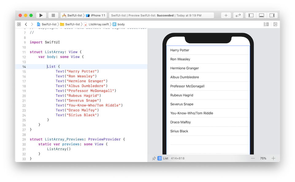
For example if I wanted to display a list of names in the typical iOS list style, the manual way is to have a group of Text() views with the names.
List {
    Text("Harry Potter")
    Text("Ron Weasley")
    Text("Hermione Granger")
    Text("Albus Dumbledore")
    Text("Professor McGonagall")
    Text("Rubeus Hagrid")
    Text("Severus Snape")
    Text("You-Know-Who/Tom Riddle")
    Text("Draco Malfoy")
    Text("Sirius Black")
}
Adding any number of modifiers to any of those list items is possible. Of course while this is not practical for regular development, a manual list serves its purpose in a prototype. In a future course we'll display lists, some pulled from regular data and some that can easily be written out manually, especially if you don't want to avoid variables. An ecommerce app may have a category list which may simply be hardcoded for faster prototyping.
List {
    Text("Coffee")
    Text("Brewers")
    Text("Grinders")
    Text("Accessories")
    Text("Merch")
}
Let's step into a little bit of Swift the simplify the example by making it dynamic. You can store all those names in a single variable called characters, a comma-separated list of strings, then use List to loop through the list in the variable. I am actually using the term variable loosely here—we are creating a container (called an array or object) that we're putting data into.
There are two attributes that we define for the list—our characters variable and the part of the variable we want to identify as unique, which here is itself. In a more complicated scenario, each name in the characters variable might have more data points including an unique ID for each person which we might use for the id: attribute. Swift let's us keep things simple though.
If you look at Apple's own SwiftUI tutorial on the List, you will learn that lists need something unique to help identify one element from another. So we might define an ID field that's unique, or in this case we know each name is different.
With each pass through the characters variable, the List will pick out one element which we've called character as it's the singular form. Then to display the name, we pass that singular character into the Text() view. And the resulting layout is the same.
struct ContentView: View {

    var characters = ["Harry Potter", "Ron Weasley", "Hermione Granger",
    "Albus Dumbledore", "Professor McGonagall", "Rubeus Hagrid", "Severus Snape",
    "You-Know-Who/Tom Riddle", "Draco Malfoy", "Sirius Black"]

    var body: some View {

        List(characters, id: \.self) { character in
            Text(character)
        }
    }
}
Lists are just one common building block you may use to achieve your design. Similar to other views, the List can be styled to match your design. Or you might find another way to make a repeating group of components. All things we'll explore in future courses!